
Architecting a universal design system
From chaos to cohesion: how I turned multiple overlapping projects into one scalable, adaptable ecosystem and cut future design and development time without sacrificing brand nuance.
Client
Multiple
Year
2024-2025
Scope

Challenge
In late 2024, rapid agency growth exposed the cracks in our workflow.
As the solo designer, creating bespoke UI kits for every client was no longer sustainable. We faced a critical trade-off: rush the work and risk quality, or miss timelines.
The friction points were clear:
Redundant effort: design & dev rebuilding identical patterns for every new project.
Siloed workflows: even when a functionally identical component existed elsewhere, pulling it in wasn’t feasible, so we rebuilt it from scratch under time pressure.
Fragility: a small tweak (like a color or spacing) required updating every instance of a component by hand.
Drift: without clear specs and guidelines, developers had to interpret designs, so Figma and production drifted. No single source of truth - decisions lived in files and messages, and teams made different choices over time.
It was clear that repeating our old habits would only magnify these issues with the new workload. I realized I needed to stop thinking about individual projects and start building a single, universal system.
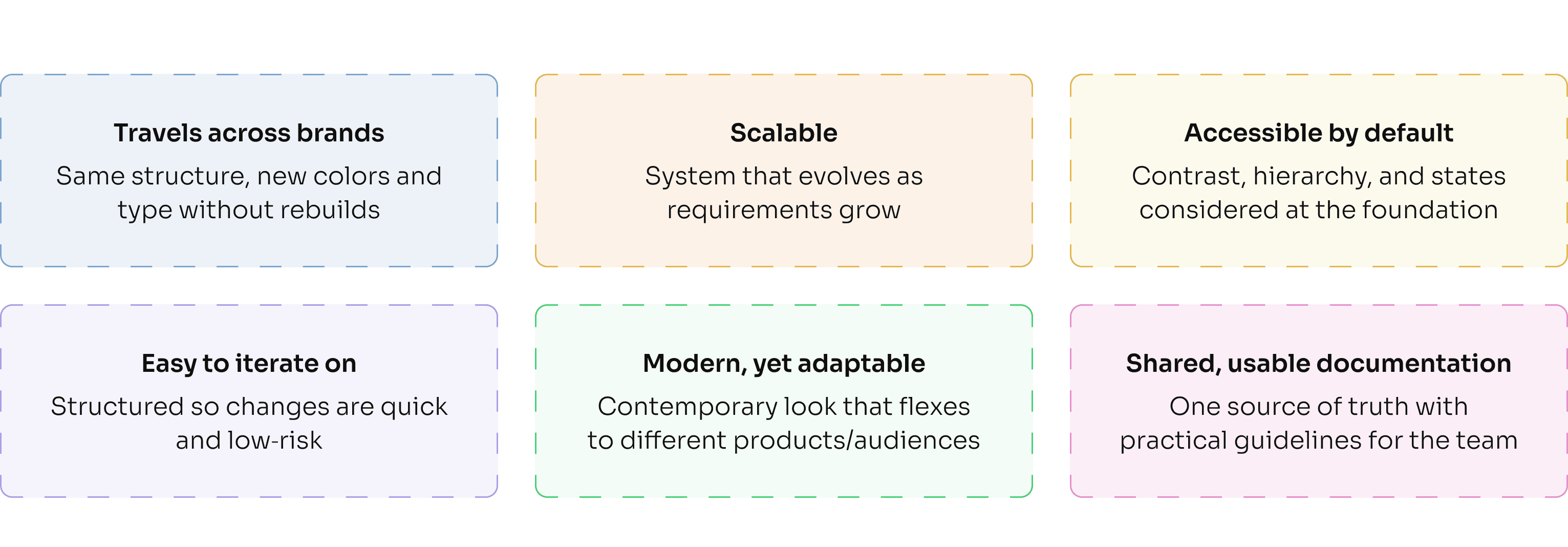
The challenge was to create a system that was flexible enough to adapt to different client brands, strict enough to enforce quality, and served as a single source of truth that was easy for developers to implement accurately.

Approach
Before I could focus on visual execution, I needed a plan of action. To move from bespoke UI kits to a proper, reusable design system, I started by mapping what 'good' should look like for our context:
However, their documentation showcases the polished output, not the architectural wiring. They were aspirational, but they didn't show the "messy underground" of how to actually structure the tokens and specs for a team building from scratch.
The real breakthrough came when I shifted from studying what they built to how they built it, which led me to the discovery of Atomic Design and design tokens.
This gave me the perfect blueprint: Atomic Design provided the structural logic for building components, while tokens ensured the visual language could flex across different projects & brand identities.
Here is how I organized everything using this principle, starting with the smallest pieces and building up:

The blueprint: primitives, semantics, and building for scale
This system needed to work for multiple clients, where brand colors and fonts would always be different.
Here is where design tokens shine. I decoupled Primitives (raw hex values) from Semantics (intent). By separating 'what the color is' from 'the role it plays,' we can now re-brand an entire product simply by re-mapping the semantic layer, without touching the core components.
During this step, I made sure to align the plans with the team to reduce any potential slowdowns. I sat down with our lead developer and we shaped spacing and naming to match their workflow. We adopted a simple 4‑point rhythm that can grow in small, predictable steps, so layouts stay consistent now and remain easy to extend later, with no rewrites, just additions.
Not every decision needed endless options. For things like borders, corner radii, and shadows, we chose a small, clear set ("T-shirt sizing", think XXS to XXL). Fewer choices meant faster builds and a more consistent look.
Typography followed the same principle: swap, don’t rebuild. The font family is a single variable, and sizes follow a steady scale tied to our grid, with sensible line heights so text reads well across brands.
The throughline: build with the team, keep the system lean on day one and add as you go by structuring the system in a way that future growth is painless (or as close to it as possible).


Building the component library: core principles
With the foundations set, it was time to build the components, the reusable building blocks of our system. I focused on a few core principles to guide the process.
Configurable base → faster builds
In order to reduce the system complexity, I built components to be configurable. By adjusting a few properties (likesize,state, orwithIcon), we could adapt a single base component for multiple needs. This saved significant design and development time.This approach also simplifies building new components. Here I show how fast a search bar component can be created: instead of making a brand‑new thing, I started from our input and adjusted the instance. Devs didn’t rebuild; they extended. We stayed visually consistent without slowing down.
(This is an ongoing learning process. Our team is still refining how we identify which elements should be globally reusable versus which are true one-offs, but this approach has been a huge win for simpler, foundational components.)
Nested components
Following Atomic Design, smaller "atoms" (like an icon or text label) were nested inside larger "organisms" (like a full button). This meant a change to a base component would instantly and safely update everywhere it was used across the entire system. It also made adding new variants simple: I could add an option to the base component without having to rebuild the larger, more complex ones.
Auto-layout for responsive behavior
Each component was built with Figma's Auto Layout to be inherently responsive. This ensured they would adapt well across different screen sizes.Tokens & variables
To bridge the design-to-code gap, I defined each component's internal structure using our foundational spatial tokens (e.g.,radius-sm,spacing-4). This created a clear contract for developers, and ensured the final build matched the design precisely.

Prototyping as a communication tool
I connected component variants to create interactive states (like hover and pressed) directly in Figma. This turned static designs into live demos, making design reviews with stakeholders faster, more intuitive, and left less room for ambiguity.
The rules that defined my thinking process and would allow us to scale was this: change a value, not the design; enforce consistency through structure; build from a single source of truth.

Theory meets practice: what I've learned along the way
Lessons from the build: empathy for the developer
A design system fails if it doesn't serve its primary users: the developers.
The “base” ships, the “mapped” explains
Initially, I designed complex components with specific, realistic data already applied. My lead developer quickly pointed out they first build the generic, "empty" component, then connect it to data. We adopted this workflow: the library now provides the clean base component for developers, alongside a mapped example with realistic content for context and for usage in designs.
Keep families together to keep context
Splitting atoms and organisms into separate pages looked tidy but broke context. Tables and table cells live together now. Seeing the base next to the thing that uses it made inheritance obvious and updates easier.Contextual Documentation
Many systems I studied hid documentation in separate docs. Looks clean, but in reality devs have to search for all the possible variants and tokens applied to a component, which takes a lot of time and opens a possibility of error. After communicating with the dev team and learning what information they need, I created specs and tokens sheets pinned beside each component. It drastically cut down on searching, reduced guesswork, and led to faster, more accurate implementation.Properties are tiny acts of architecture
Naming properties is an act of information architecture. A generic property liketypeis ambiguous. I learned to use architectural naming likeintent(destructive, confirm) orcontext(input, dropdown). This foresight turns future refactors into simple additions.

Impact & retrospective
The ROI
While the system is a living product, the immediate impact on our operational efficiency has been measurable:
Velocity: accelerated feature delivery by decoupling design decisions from build time. We no longer build from scratch; we assemble.
Design-to-code parity: achieved a near-zero drift between Figma files and production code, ensuring the final product honors the design intent.
Operational efficiency: drastically reduced QA cycles and "interpretation" errors during handoff, allowing the team to focus on logic rather than pixel-pushing.
Future Roadmap
A design system is never "done." My focus is now shifting from creation to governance:
Scaling the library: Expanding beyond atoms to include page-level templates and patterns.
Formalizing governance: creating "Do's and Don'ts" documentation that ensures the system remains stable as the team scales.
Validation: as adoption spreads across agency products, I will be establishing feedback loops with the development team to measure the system’s effectiveness and identify friction points.
Reflections
Architecting this system as a solo designer required strict prioritization between immediate project needs and long-term infrastructure.
The process reinforced that a design system is a social contract between design and engineering. The technical challenge of structuring complex variants was significant, but the true lesson lay in system architecture: learning to build structures that are rigid enough to maintain quality, yet flexible enough to withstand the unpredictable nature of agency work.

